
Why shopfront glass should work harder
For many businesses in Randfontein, Krugersdorp, Westonaria and Roodepoort, the front window is the first point of contact with a customer. It is also one of the few places that can carry your message all day, every day, without needing extra staff or moving displays around. When used well, window graphics turn plain glass into a practical business tool.
That matters in a busy trading area. People driving past on their way to the CBD, a school run, or a quick stop at the shops often decide in seconds whether a place feels open, organised and worth entering. A clear logo, trading hours, service list or promotion can make that decision easier. It is not about covering every pane. It is about using the right parts of the glass for the right job.
Window graphics also suit businesses that work with limited interior space. If you are running from a compact shopfront in Randfontein CBD or a street-facing office in Greenhills, you may not want standing signs or bulky displays near the entrance. Glass gives you a clean surface that can carry branding and information without blocking movement inside.
Three jobs a good window graphic should do
Not every window graphic needs to carry the same message. The best results usually come from separating the job into three parts: branding, privacy and promotion. If all three are forced into one crowded layout, the window becomes hard to read from the pavement or from a car.
- Branding: Your name, logo, strapline and colours should be easy to recognise at a glance.
- Privacy: Frosted sections, solid colour blocks or partial coverage can reduce direct visibility into work areas or waiting spaces.
- Promotion: Short-term offers, seasonal specials and opening notices can sit in a position where they are easy to replace later.
For example, a takeaway in Mogale City may want full privacy at the prep counter but still needs a clear opening-time panel and a few promotion stickers on the front glass. A clinic or salon might prefer more frosted coverage for comfort, then use smaller printed areas for services and appointment details. The layout should match how the business actually works, not just what looks neat on paper.
Local weather, glare and daily wear matter
Window graphics in the West Rand have to deal with direct sun, dust, occasional strong wind and daily cleaning. On glass that faces the road, glare can make a message hard to read if the artwork is too pale or the contrast is too low. In summer, intense light can also fade weak colour choices quicker than many owners expect. Good planning helps avoid that.
It is worth thinking about where the sun hits during business hours. A west-facing window can benefit from bolder lettering and fewer fine details. A shaded frontage may allow more detail, but even then the design needs to stay simple enough to read quickly. If the area near the glass is cleaned often, the print also needs to be placed where it will not peel from repeated wiping or get damaged by rough handling.
For coastal humidity businesses tend to worry about rust, but inland shops have their own issues too. Dust, tinted windows and condensation from air-conditioning can all affect how the artwork sits and how long it keeps a clean edge. Choosing the right finish and keeping the design practical makes a real difference over time.
What makes a layout readable from the street
Good window graphics are judged from outside, not from a design screen. A layout that looks neat in an office can disappear once it is behind reflective glass. This is why font size, spacing and contrast matter so much. Small wording can work on a handout, but it often fails on a moving street view.
Keep the message short and useful. A passer-by should understand what you do without standing still for long. If the window is large, use the space with purpose rather than filling every gap. White space can help the eye rest and make the important details stand out more clearly.
- Use large lettering for the business name and key service.
- Keep contact details to the essentials, such as trading hours or enquiry instructions.
- Separate offers from core branding so the message stays clear.
- Match the artwork to the actual size of the glass, not only the design concept.
In practice, this means a Roodepoort hardware store may need bold service wording and a simple promotion panel, while a Westonaria admin office might prefer a cleaner, more private front with only one or two clear notices. The same principle applies in every town: people should be able to read the message fast.
When window graphics help with privacy as well
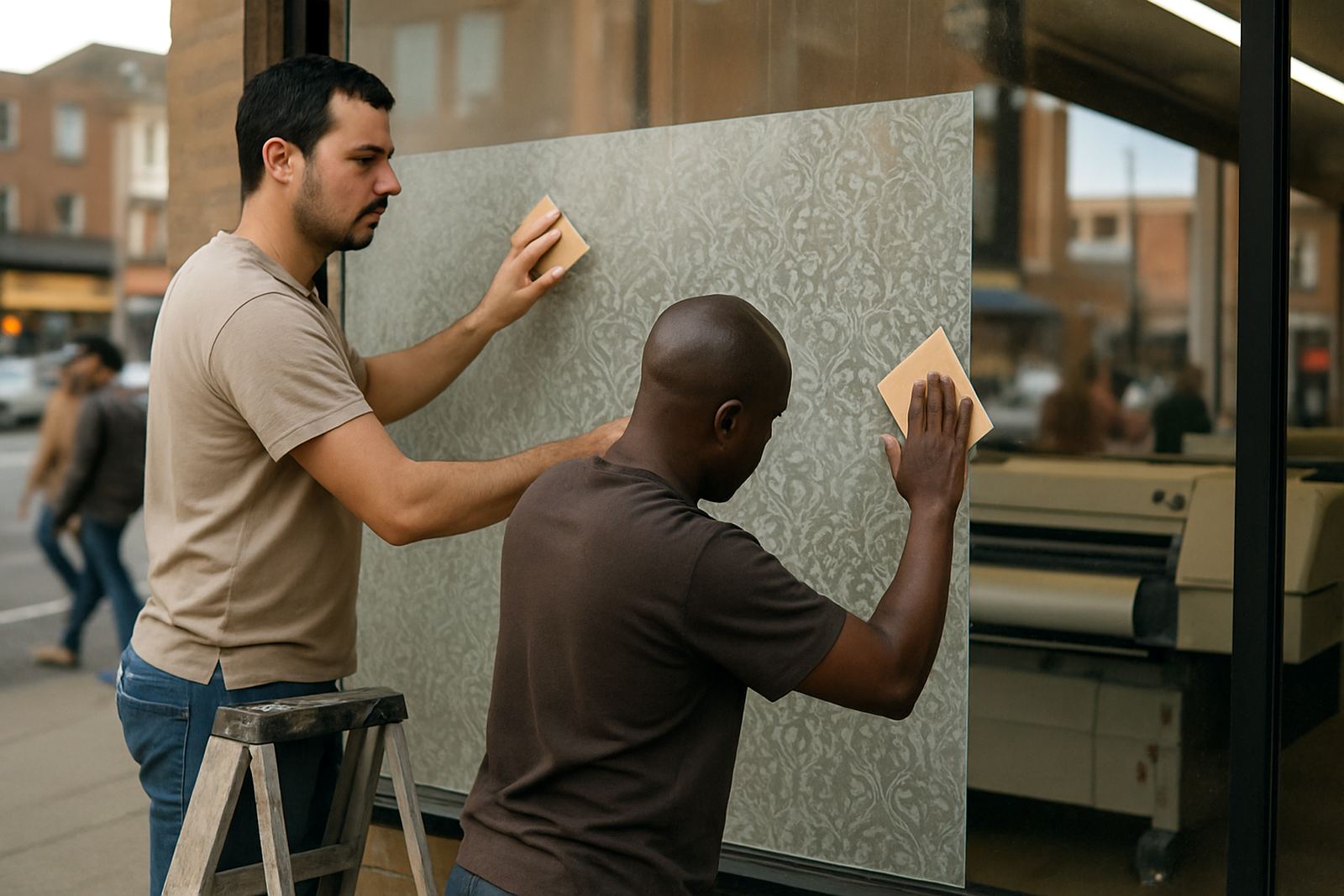
Privacy is one of the most practical reasons businesses choose glass graphics. Staff do not always want every part of the work area visible from the street and customers often feel more comfortable when there is some separation between the outside and inside space. This is especially useful for reception counters, consulting rooms, treatment spaces and back offices near the front window.
A well-placed frosted strip or printed block can give enough cover without making the premises feel closed off. That balance is important. Too much coverage can make a shop look shut during business hours, while too little can leave the inside exposed. The right mix lets natural light in and still keeps the space professional.
For many Randfontein businesses, privacy also helps with practical work. Staff can manage paperwork, stock handling or customer payments without feeling watched from the pavement. It is a small change, but over a full business day it can improve focus and reduce distractions.
Using the glass for everyday promotions
One of the strongest values of window graphics is how quickly they can support daily promotions. A special price on a service, a school holiday deal, a month-end offer or a new product line can be displayed where passing traffic already looks. That makes the window a live sales surface, not just a sign.
For businesses that change offers often, it helps to plan a layout that allows updates without redoing the entire window. Fixed branding can stay in place while smaller promotional elements change as needed. This is useful for salons, eateries, training centres and shops that run regular specials. It also keeps the cost of updates lower over time.
A local example is a Randfontein CBD retailer running a weekend sale. The business can keep its main logo and trading hours on the glass, then update the promotion panel each month. That way the frontage stays recognisable while the offer remains current. It saves time and gives customers a clear reason to step inside.
Getting the artwork ready before print
Window graphics work best when the artwork is prepared for real-world use, not just for viewing on a phone. That means checking spelling, aligning the layout to the exact glass size and making sure the message still reads well from a distance. If the window has handles, frames or tiled walls nearby, those details need to be accounted for in the artwork so the final result sits properly.
It also helps to decide early whether the glass should carry a full graphic, a partial panel or a mix of clear and printed sections. That choice affects visibility, light and maintenance. Businesses in Krugersdorp and Mogale City often need a different layout from a smaller storefront in Toekomsrus or Mohlakeng, even if the services are the same. The premises, traffic flow and customer expectations can all differ.
At @Print, the focus is on making the message practical for the site. That means helping with design updates, artwork redraws, proofing changes and print ready setup so the final window graphic fits the frontage properly and does the job it is meant to do.