
Start With the Viewing Point, Not the Wall
Before you choose a spot, think about where people naturally stop. A poster placed where someone is already waiting or queuing will usually perform better than one tucked away near a side wall. In a busy Randfontein shop, that might be the payment counter, the entrance queue, or the corridor leading to the till area. In a reception, it might be opposite the seating row or beside the sign-in point where visitors pause for a moment.
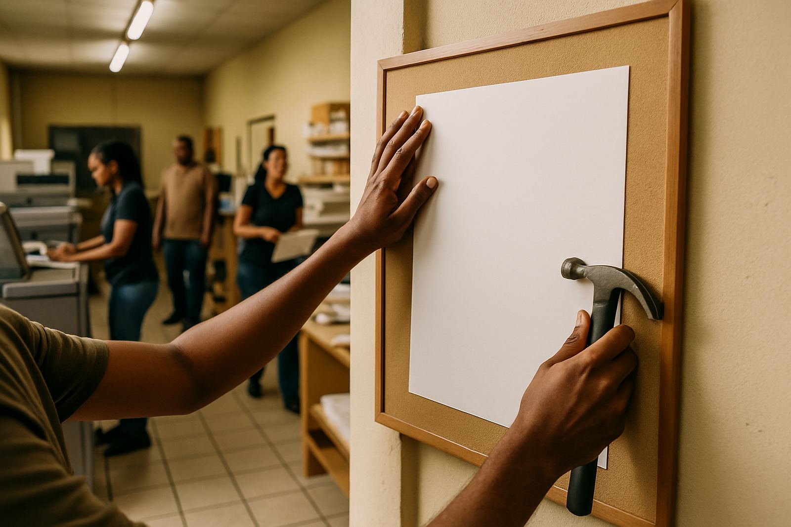
The main rule is simple: posters should meet people at eye level and in a place where they have a few seconds to look. If the message is meant to drive action, such as a special offer or booking prompt, the poster must be close to the decision point. A poster about a new lunch special works best near the ordering point. A notice about a community event works better near the gate or reception where people are arriving.
Light also matters. In many West Rand spaces, strong sunlight can fade certain print stocks faster than expected, while dim indoor corners make small text hard to read. If the area gets direct sun from a window, use a spot with better shade or ask for a more durable finish. Good placement saves money because the poster stays legible for longer and does not need replacing so often.
Use Poster Size to Match the Space
Not every wall needs the same size poster. A small A4 or A3 poster can do the job in a narrow passage, while a larger A1 or A0 format is better for open spaces with more foot traffic. If the room is tight, going too large can make the poster feel crowded and people may ignore it. If the room is spacious, a small poster gets lost very quickly.
Think in terms of distance. If someone will stand one metre away, a compact poster can work. If they are looking from across a room, the headline must be bigger and the layout simpler. For shops in Greenhills, Toekomsrus or Mohlakeng, this matters in spaza stores, takeaway counters and service points where people move fast and do not have time to read long copy.
- Use A4 for close viewing, such as notices at a counter or inside a reception.
- Use A3 for mid-range visibility in shop aisles, notice boards or waiting areas.
- Use A1 or larger for main walls, windows and outdoor-facing spaces with foot traffic.
- Keep the headline short and the key offer easy to spot from a distance.
Best Poster Spots Inside Shops
Shops need posters that support the flow of customers, not block it. The best spots are usually where people pause naturally. Near the entrance, posters can introduce a special offer before the shopper starts browsing. Around the till, they can encourage add-on buys or remind customers about a promotion. On a side wall near a high-traffic aisle, a poster can support a seasonal message without getting in the way.
For retail spaces in Krugersdorp, Westonaria and Roodepoort, practical placement often means working with what the store already has. A poster may fit better beside a product display than above it, especially if the display changes often. Posters near fridges, service counters and queue lines usually get more attention than posters placed too high up. Keep the bottom edge clear of bins, stacked stock and display shelves so the full message stays visible.
If you are using posters for price notices or service information, make sure the wording is current. Nothing weakens a printed poster faster than an outdated date or old special. It is worth checking the content before every reprint, especially if the campaign runs for only a week or two.
Reception Areas Need Calm, Clear Placement
Reception posters should help people feel informed, not overloaded. A reception is often the first proper contact point in a business, so the poster should be neat, easy to scan and placed where it supports the room. The space beside the sign-in point works well for visitor notices, office rules or service information. The wall behind seated visitors can work for brand messaging, community notices or business credentials.
Avoid putting too many posters together in one corner. When several posters compete for attention, people stop reading. One strong poster placed correctly is more useful than three smaller posters fighting for space. In office receptions around Mogale City or Randfontein CBD, a simple layout with enough breathing room usually looks better and reads faster.
Reception spaces can also have lighting challenges. Bright overhead lights, reflective tiles and glass partitions can create glare. If the poster is under strong artificial light, use a matte finish where possible so the text remains readable from different angles. This matters for visitors who are standing, sitting or moving past the area. It also helps after load-shedding, when lighting may change suddenly and a reflective surface becomes harder to read.
Community Halls, Clinics and Churches Need Simple Messages
In community spaces, posters often need to be understood quickly by people of different ages and reading speeds. That means clear headings, larger type and fewer words. A poster for a clinic notice, church event, school fundraiser or local meeting should be placed where people gather, not in a side passage that few visitors use. Notice boards, entrance walls and foyer areas are usually the first places to check.
Placement should also consider crowd movement. In a hall or clinic waiting area, posters should not interfere with queues, doorways or wheelchair access. If a poster is too low, it can be blocked by chairs or people standing in line. If it is too high, older visitors may miss it. Eye-level placement is still the safest choice and works well in most municipal and community environments.
- Put event posters near entrances where people arrive with time to look around.
- Use notice boards for repeat information such as opening hours or service days.
- Keep important dates large and readable from a few steps back.
- Place posters away from humid corners, leaking roofs or areas with frequent cleaning splash.
Local Example: A Randfontein Print Placement That Worked
A small hardware shop in Randfontein CBD wanted more attention for a weekend paint promotion. Instead of putting the poster deep inside the store, the team placed one A1 poster in the entrance view, another beside the till and a third near the aisle where customers picked up paint and brushes. The main headline was short, the price was visible and the layout left enough space for people to read it while queuing. Sales improved because the poster reached customers at the exact moment they were deciding what to buy.
That is the practical part of poster placement. You do not always need more posters, just better positions. In some cases, one well-placed poster near the decision point is enough. In others, a small set of posters can guide people through a space from entrance to enquiry point. The job is to move the message into the path of real foot traffic, not to cover every open wall. It sounds simple, but in business spaces the right placement often does more than a bigger design ever could.
For West Rand businesses, this approach works across shops, clinics, offices and community venues. When a poster is sized properly, placed at the right height and kept clear of clutter, it becomes part of the room and starts doing useful work immediately.
When to Reposition or Reprint
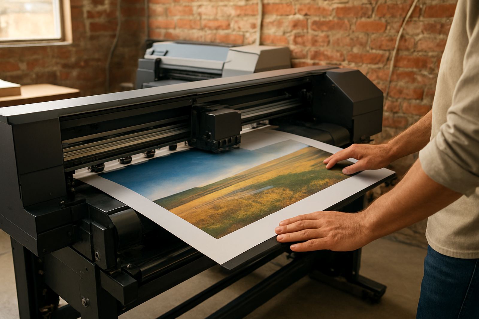
Posters do not stay effective forever. If the room layout changes, if stock moves, or if the campaign ends, the poster may need to be shifted or replaced. Sun exposure, dust and repeated cleaning also affect how long a poster stays presentable. In some spaces, especially near doors or windows, a poster can start curling or fading sooner than expected. If that happens, moving it to a more sheltered point may help, but a reprint is sometimes the better choice.
As a rule, check poster placement every time the space changes. A new display unit, a moved counter, or a revised queue line can all reduce visibility. The best poster is one that still makes sense after the room has changed. That is why practical placement matters as much as artwork, size and print finish.