Why one small wording error can waste a whole print run
Print is unforgiving. Once artwork is sent for production, a missing letter, wrong street name or old price can end up on every item in the batch. For a Randfontein business, that can mean handing out flyers with the wrong trading hours, or printing 1 000 stickers that still carry an outdated WhatsApp number from last year. Even a simple spelling slip can make a flyer look rushed and not very trustworthy.
That is why proofing matters before approval. Whether you are ordering business cards for a sales team in Krugersdorp or banners for a promotion in Roodepoort, the wording has to be checked with the same care as the layout. The cleaner the copy, the easier it is for your customer to understand what you do and how to reach you.
- Check names, titles and contact details first.
- Make sure prices, dates and times are still current.
- Read the final proof slowly, line by line.
The most common mistakes we see in business artwork
Most print errors are not dramatic. They are the kind of small things people miss because they know the wording too well. A line may look right at first glance, but once it is on a business card or brochure, the error becomes hard to ignore. In a busy print shop, these are the details that need a second look before anyone approves the file.
Some of the most common problems include:
- Misspelled company or product names.
- Wrong phone numbers, messages or web addresses.
- Old trading hours, old prices or outdated special offers.
- Too much text crowded into a small area.
- Mixed spelling style, such as colour and colour in the same layout.
- Missing punctuation that changes the meaning of a sentence.
A proof is not only about spelling. It also shows whether the wording fits the space. A flyer with long sentences may look fine on screen, but once printed it can feel cramped and hard to read. Shorter lines often work better, especially for posters, menus and banner artwork.
How to proofread artwork properly before approval
Good proofing takes a bit of discipline. Do not read the proof once and assume it is fine. Read it again after a short break, then ask someone else to read it too. A fresh set of eyes often spots what the person closest to the business has overlooked. That applies whether you are approving a logo refresh, a brochure layout or a simple set of stickers for product labelling.
Use a proper checklist rather than relying on memory. Start with the basics, then move on to layout and consistency. This helps when the artwork includes several lines of copy, for example on a menu layout or form design. It also helps when there are multiple people involved, such as one person checking the prices and another checking the contact details.
- Read every heading, subheading and body line out loud.
- Check every number, including unit prices and quantities.
- Confirm spelling on names, suburbs and towns.
- Look at alignment, spacing and line breaks.
- Compare the proof against the original brief or notes.
Local example: a Westonaria flyer with one wrong detail
Picture a small business in Westonaria planning a weekend promotion. The flyer is ready, the design is neat and the offer looks strong. But the trading hours show Saturday 8:00 to 12:00 when the store actually opens at 9:00. If that flyer goes out to schools, spaza shops and local noticeboards, customers arrive too early and may leave annoyed. A simple hour change can affect the whole campaign.
We see this often with same-day digital print work for West Rand businesses. A client in Mogale City may need business cards by lunch, while a Roodepoort team wants posters up before the weekend. In both cases, the artwork has to be checked quickly but properly. One wrong line can turn a useful print run into a costly reprint, and nobody wants that when margins are already tight.
That is why proofing updates matter. If the wording changes after design, it must be checked again before print. Even a small edit can shift the layout, push a line off the page or create a typo where a word was moved around too fast. This is where careful review pays off.
What to check on different print items
Different products need different checks. A business card has very little space, so one bad line stands out immediately. A flyer allows more information, but that also means more room for errors. Posters and banners are often read from a distance, so the wording must be short, direct and easy to scan.
For each item, look at the detail that matters most to the person reading it. If the piece is for a new menu, check dish names, pricing and spellings of ingredients. If it is a form, check field labels and instructions so people do not get confused. If it is sticker design for packaging, make sure the size of the text suits the label and that nothing important gets lost near the edge.
- Business cards: names, job titles, contact lines and company name.
- Flyers: offer wording, dates, times, venue and spelling.
- Posters: headline, key message and distance readability.
- Banners: short text, large type and correct contact details.
- Stickers: product names, batch notes and label spacing.
A practical final check before your file goes to print
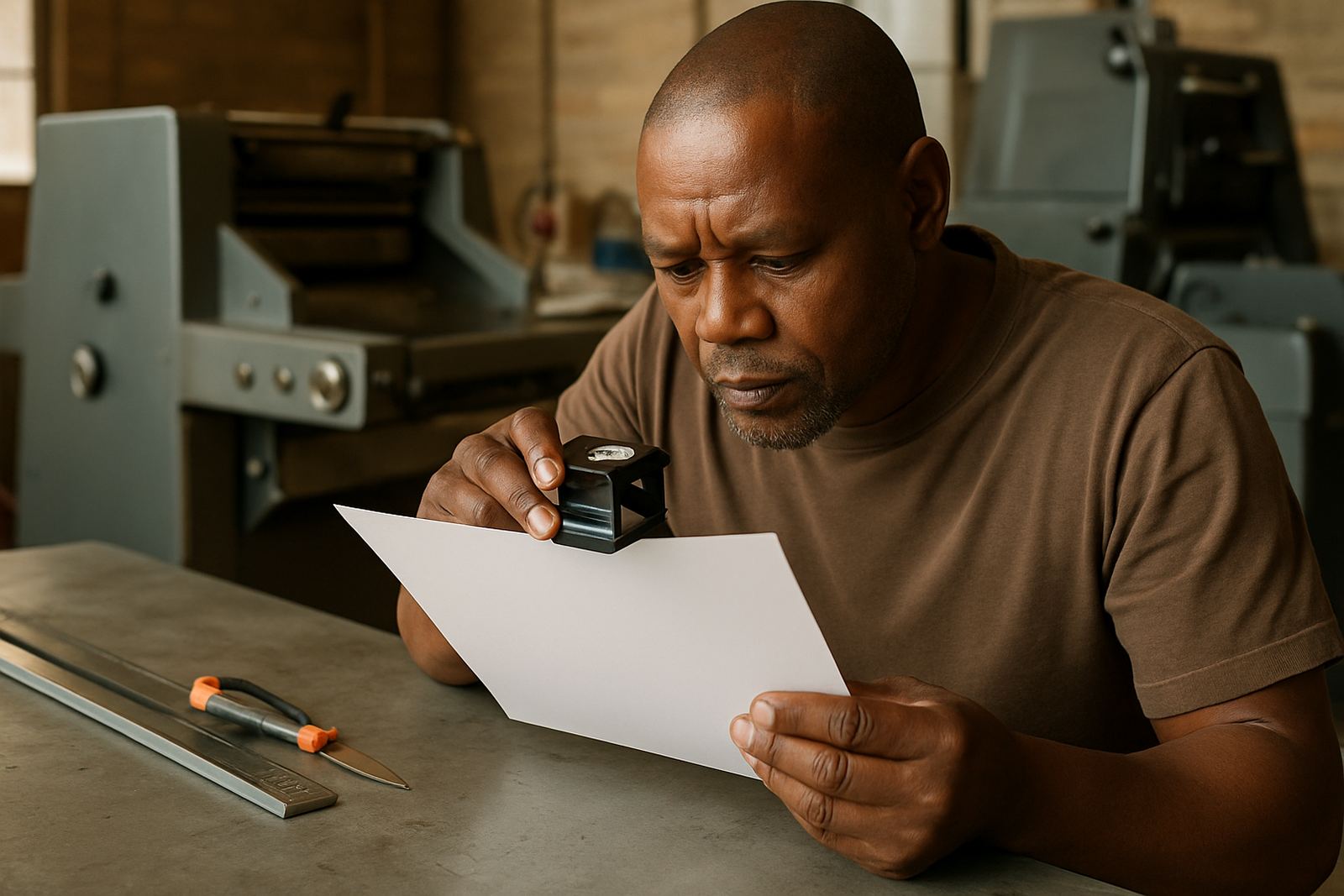
The last read-through should be calm and focused. If possible, print the proof on paper instead of only viewing it on a screen. Small errors are easier to spot on paper, especially when the job includes light text on a dark background or tight spacing between lines. For busy businesses in Randfontein CBD, this final step can save a lot of back-and-forth later.
It also helps to check the file under ordinary office lighting, not just near a bright window. Screens can hide weak contrast or make text appear more readable than it really is. When the job is meant for outdoor use, such as a banner on a fence or a poster in a shopfront, make sure the wording is short enough to be read quickly by people passing on foot or in traffic.
Once the wording is correct and the layout looks balanced, you can approve with more confidence. That leaves the print team to handle the production, finishing and turnaround. Good proofing does not need to be complicated, but it does need attention. A few minutes now is better than reprinting later because a date, number or name was wrong.