
Safety Posters For A Busy Industrial Site
The client was an industrial operation in Mogale City needing a fresh set of safety posters for staff areas, passageways and shared notice points. The campaign covered core workplace messages such as PPE compliance, hazard awareness, no smoking zones, emergency steps and housekeeping reminders. The posters had to do more than look neat. They needed to be readable at a glance, simple enough for mixed literacy levels, and strong enough to stay up in high traffic areas where dust, handling and constant movement are part of the day.
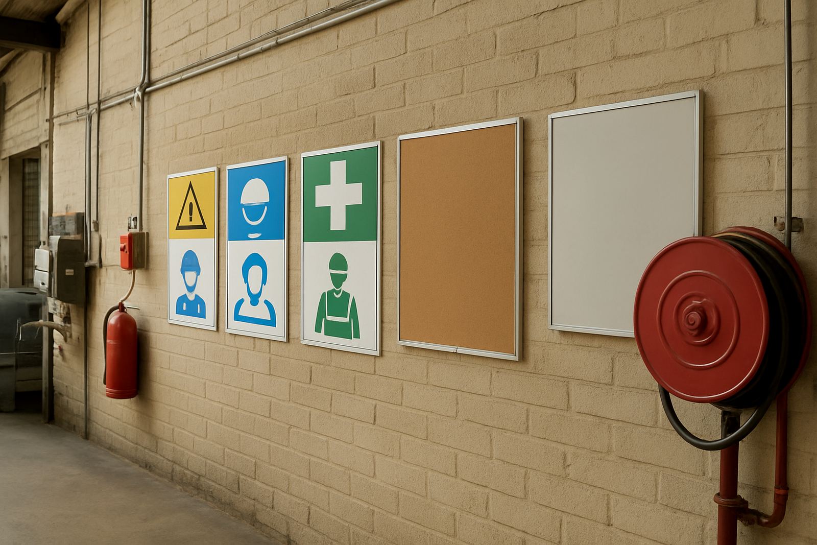
Because the site had changing shifts and a few different buildings, the poster set had to work across canteens, entrances, workshop walls and store areas. The client wanted one clear visual system so the notices would feel like a set, not a mix of unrelated sheets pinned up where ever there was space.
The Brief And The Limits We Worked To
The main brief was practical communication, not branding for its own sake. The client needed the posters completed in under two weeks, with artwork that could be signed off quickly and printed in a size that suited wall mounting. They also asked for wording that was firm but not overcomplicated, because the notices had to be useful to supervisors and line staff alike.
There were a few constraints. Some messages came from internal safety notes that were not written in a print-friendly way, so we had to tighten the copy without changing the meaning. A second issue was contrast. In an industrial setting with grey walls, fluorescent light and background clutter, pale colours and thin type would disappear. We also had to keep the artwork clean enough for later updates, since a few messages may change with new procedures.
- Fast turnaround for approval and print
- Simple wording that still met site safety needs
- Strong contrast for factory and warehouse walls
- Artwork that could be updated later without starting again
What We Supplied And How It Was Set Up
We prepared the full poster series from layout through to print ready artwork. The design work was handled by our graphic team, with the client services lead coordinating feedback and the production side checking final sizing before print. Each poster followed the same structure so the campaign felt orderly across the site. Headings were made bold and direct, body copy was kept short, and the most important instruction on each poster sat at eye level in the layout.
The posters were produced in large format digital print for indoor use, with finished sizes chosen to suit the main notice points. We used a durable paper stock and a protective finish suitable for regular handling. On a site where humidity, dust and constant foot traffic can shorten the life of weak printed material, that mattered. The final set included multiple poster types so the client could rotate messages by area instead of repeating the same notice on every wall.
- Large-format safety posters for indoor placement
- High contrast layouts for quick reading
- Print ready artwork supplied after proofing
- Suitable for office, workshop and common area display
Turnaround, Proofing And Final Print
The project ran over two weeks from first brief to handover. In week one we took the client’s notes, cleaned up the wording, built the poster layouts and sent proofing updates for review. Once the wording was approved, we moved into final artwork checking and print preparation. Week two was used for digital printing, cutting and finishing, then a final quality check on colour, alignment and trim before release.
That proof stage was important. Safety material can fail if the wording is cramped or if a warning line gets lost in the layout. We therefore checked line spacing, font size and hierarchy on each file before print. The client also wanted the posters to match one another closely, so we kept margins and headline placement consistent from page to page. It saved time on site because the team could put the posters up without sorting through different sizes and formats.
- Week 1: brief, copy clean-up, layout and proofing
- Week 2: final approval, print, trimming and finishing
- Quality check done before release from the shop floor
- Consistent sizing to make installation quicker
What Changed On Site After Installation
Once the posters were up, the client had a more orderly way to reinforce safety talk across the site. Supervisors no longer had to rely on mixed notices printed from different sources, and staff areas looked more organised. The strongest gain was visibility. The messages were large enough to be noticed as people moved past, which is exactly what safety signage should do in a working environment.
The client also had an easier time rotating topics between areas. A notice near the entrance could focus on visitor control, while workshop walls carried machine safety and PPE reminders. In practical terms, that meant the posters worked as a communication set rather than just wall decoration. For a busy industrial workplace in Mogale City, that kind of clarity helps keep the message in front of people day after day.
From our side, the result confirmed that clear layout, honest wording and the right print size matter more than fancy effects. The posters did their job because they were built for the space they would live in, not for a presentation room.
What We Would Repeat On The Next Safety Rollout
If we were repeating this project for another industrial client, we would follow the same approach: start with site conditions, reduce the wording to what staff actually need, and choose sizes based on viewing distance. That saves time and avoids unnecessary rework. We would also recommend planning for future updates from the outset, because safety procedures and site notices do change.
For workplaces in Mogale City, Krugersdorp, Westonaria, Roodepoort and nearby West Rand areas, this kind of project works best when the print supplier understands the pace of operations. A quick brief, clean proofing and proper finishing make the difference between posters that get ignored and posters that stay useful. This one was straightforward, but it needed careful handling, and that is where the result came from.
Key facts
| Project type | Large-format safety poster campaign |
|---|---|
| Client location | Mogale City, West Rand |
| Business type | Industrial workplace |
| Timeline | 2 weeks from brief to handover |
| Print method | Digital print with finishing |
| Use case | Indoor safety communication across multiple site areas |